The Process of a Lyric Video
What exactly IS a lyric video? That was my initial question as I was tasked to create one for “All Alright”. I quickly learned, that a lyric video is a music video where the words to the song are the primary focal point. Coming from a background both in graphic design (with a heavy emphasis in typography), and as a motion designer… my excitement level for this project instantly shot off the charts. After some quick research of other lyric videos, I knew we were primed to create one different from the rest.
What exactly goes into making a video like this? How did I wind up with the final product? Hopefully this post will clear up some of that!
Right off the bat, I knew that I wanted the video to feel like a cohesive part of the album that the song was appearing on. With that in mind, I took a look at the record artwork for “The Grohl Sessions, Vol. 1” to gather some initial direction.
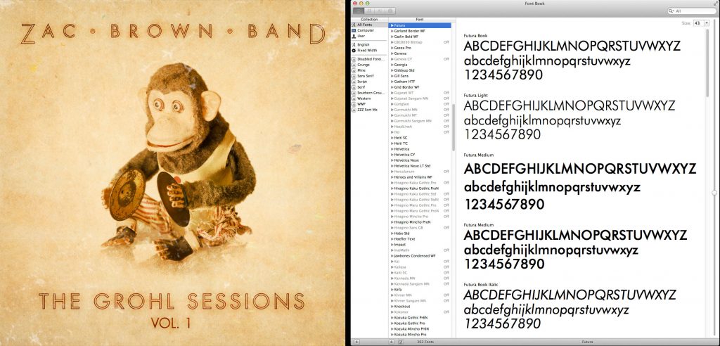
From here, I observed that the creative team set the type in Futura; a typeface from the 1920’s by Paul Renner at the Bauer Type Foundry. I really liked the aged paper texture they used for the background… so with those two items noted, I hit the ground running.
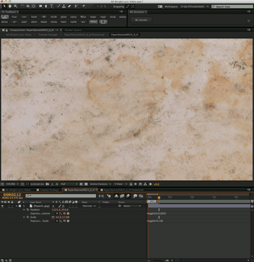
To develop the look, I took several large images of old stained paper, and imported them into After Effects. Using a wiggle expression on both the position and the scale, I was able to constantly move the paper around without animating a single keyframe. For this particular expression, I am telling the position to randomly change by +/- 600 pixels 350 times/second.
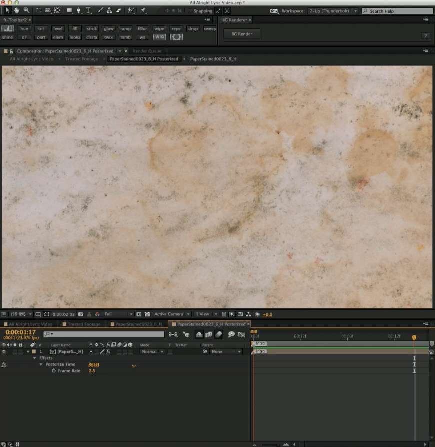
As you can see, this moves around way too fast, so I precomposed (nested) that into a new composition and used the Posterize Time effect. This effect throws away frames based it’s numeric input. Through trial-and-error, I found that 2.5 was the magic number that matched the tempo of the song. So now we have taken a 23.976fps comp, and are playing it at 2.5fps.
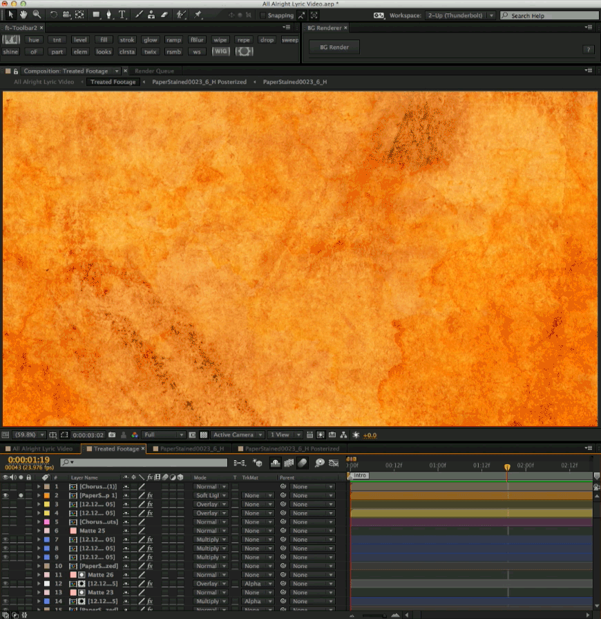
With that process worked out, I duplicated, and replaced the paper texture with new ones to get different looks. I then stacked those completed comps, and applied different color treatments/blending modes to nail down the foundation of the video. The beauty of this animation is that it was all done with math… and I never had to physically animate anything. It will also remain random, and move infinitely… meaning no two frames will ever be the same.
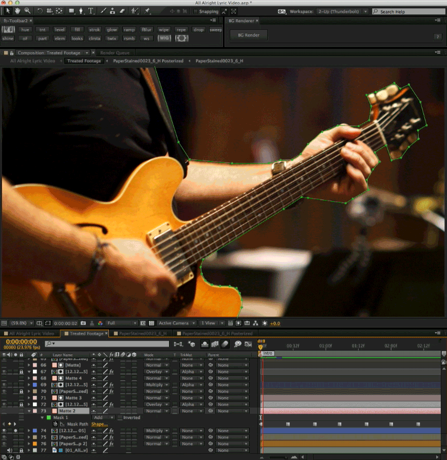
The randomized paper texture then spawned my next idea to apply the same posterization to live footage of the band recording the song in the studio… and then rotoscope to help make them look like they were stop-motion animated pieces of paper.
What is rotoscoping? Rotoscoping is a labor-intensive process, where you isolate objects from live video/film. This is done frame-by-frame by animating masks. Video/film frame-rates are 23.976fps… essentially 24 frames for every single second of footage. 10 seconds of footage yields 240 frames. So for 10 seconds of footage, you would have to animate a mask 240 times. With that math in mind, a four minute and twenty-two second video becomes quite daunting. Luckily, since I posterized the time, I only had to cut out 2.5 frames per second. This greatly reduced the workload, and helped speed things along.
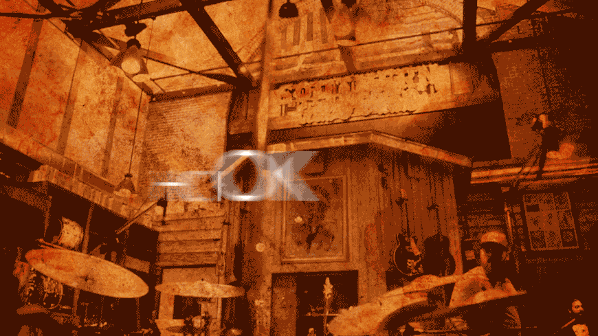
Once I had the footage rotoscoped, I added color treatment to it and layered it atop our randomized paper texture background. At this point you can begin to see the video take shape.
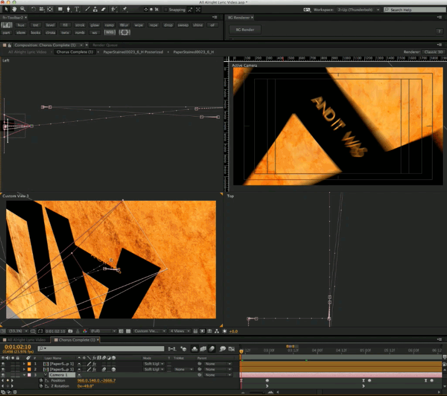
With the look and feel of the footage locked down, it was time to animate text. There are a million ways to animate text inside of After Effects. Typically, I animate a (virtual) camera to keep things moving, and I fly the text into the focal plane of that camera. I always animate the text backwards (from it’s final resting place). Here you can see an example of the camera movement in addition to the text animating independently. You can also see from the Z Rotation keyframes that the camera itself is spinning as it pulls back in space. The pink lines indicate the camera’s path through 3d-space.
Sometimes I fly the text towards the camera as well. This can create opportunities for nice transitions.
And lastly, I also like to match-move the text into the scene using 3D camera tracking. This makes the text feel like it lives inside of the scene. The multi-colored X’s indicate the track points and perspective depth of the footage.
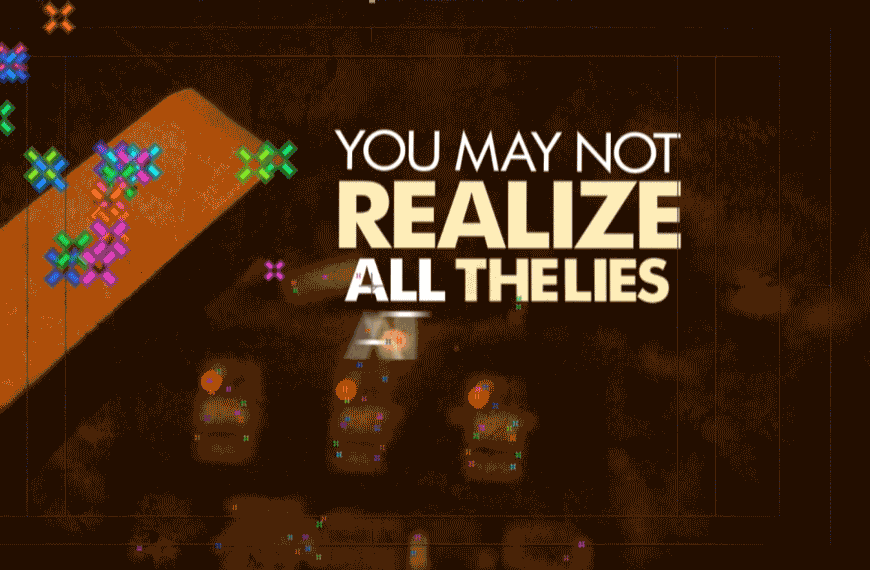
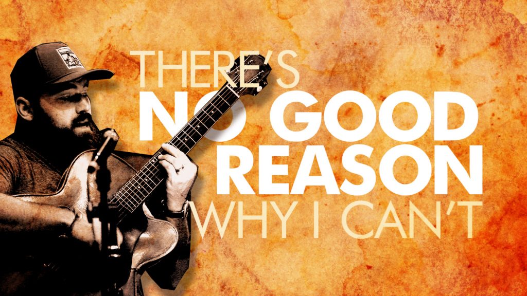
The biggest factor of all for a lyric video, is clean, concise, and effective typography. I like to utilize the different weights of the typeface, as well as shifts in color to create emphasis and hierarchy to the text on screen. As illustrated in this screen grab, you can see that the heavier weight differentiates it from the rest… isolating it and separating the message.
That covers the basics, albeit with a slight degree of technicality, of the different elements that were animated to compose the “All Alright” lyric video. This sort of work encompasses everything I love about graphic design, video, and animation. This video was an absolute blast to create and it has been a pleasure sharing some insight behind the process to make it all happen.
If you haven’t seen the lyric video, here is your chance! Click the video below to see all of these practices in action… and enjoy!